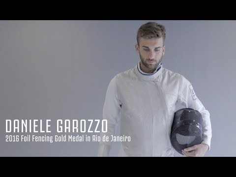
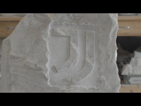
We have selected a collection of Italian artists and athletes to interpret our new logo through the medium of their own respective crafts.
This time, Juventus’ new logo is expressed in the words and art of cartoonist Mirka Andolfo.
⚪️ THE PROJECT: http://juve.it/tFGv30cCeUr ⚫️
⚪️ THE PLAYLIST: http://juve.it/s2Gy30cNzZy ⚫️





Il disegno era stupendo
No higuain el megilo lui e ARKADIUSZ milik!
fuck that new logo its fucking ugly
Bellissimo. ..brava
I dont like the new logo.
Its so ugly i cant believe it.
forza Juventus ⚽❤
A me non importa che stemma ha la juve mi importa che gioca bene e che resta sempre la stessa cioe la migliore ❤❤❤
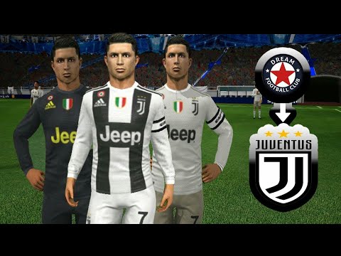
I'm a Juve fan myself but the old crest was way better. It showed class, history, tradition and values and was more stylish and modern than the current one. The old one was more representative of the club and its honor.
NON SI VENDE ALEX SANDRO
Tego sie nie dalo spierdol..
il Napoli nel 1987/88 si e' venduto lo scudetto al Milan di sacchi . totonero. informatevi .
fighissimo?
Logo di Merda!!!
#ForzaCampioni